 "Jake - Has Bad Luck So You Don't Have To" (murdersofa)
06/03/2016 at 10:56 • Filed to: None
 3
3
 24
24
 "Jake - Has Bad Luck So You Don't Have To" (murdersofa)
06/03/2016 at 10:56 • Filed to: None |  3 3
|  24 24 |
Gonna rattlecan the Riviera one panel at a time. Since I’m doing rattlecans I don’t have to shoot the whole car at once, and since I’m doing it piecemeal I can take far more time prepping and doing a (better) job on each panel. Yay! I need to do a light color to hide mistakes/dents in the bodywork, but I don’t want a “boring” car, so I’m thinking of doing a retro two-tone brown, since the roof, hood, and trunk lid are dent-free and I can afford to use a darker color on them. Behold this awful photoshop because I used GIMP and GIMP sucks wangs:
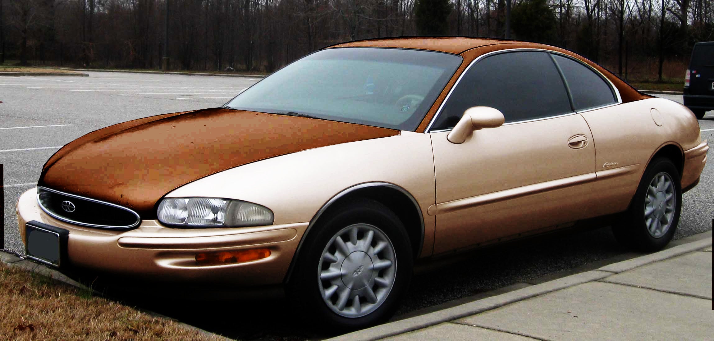
Probably gonna do the hood this weekend.
And seriously, anyone who even suggests GIMP as an alternative to photoshop is a complete idiot.
 Honeybunchesofgoats
> Jake - Has Bad Luck So You Don't Have To
06/03/2016 at 11:03 |
|
Starred because I like brown cars and think people who say GIMP replaces Photoshop are insane.
 Laurence
> Jake - Has Bad Luck So You Don't Have To
06/03/2016 at 11:06 |
|
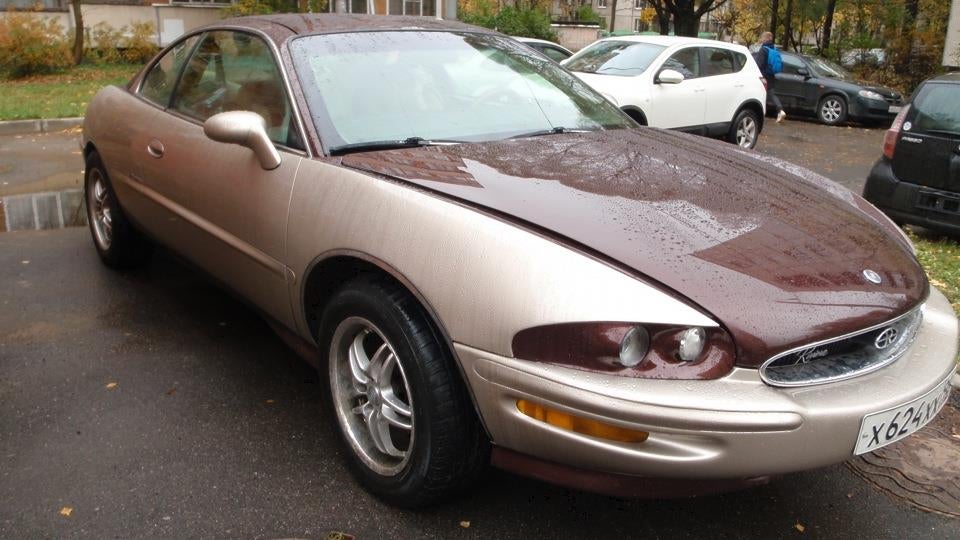
so something like this? Could look pretty interesting
 PanchoVilleneuve ST
> Honeybunchesofgoats
06/03/2016 at 11:10 |
|
I wish Manga Studio had more photoshop-like features, since I love that piece of software for drawing/digital painting.
 RamblinRover Luxury-Yacht
> Honeybunchesofgoats
06/03/2016 at 11:12 |
|
GIMP only replaces Photoshop if you’re willing to inflict the Lovecraftian horrors on your mind of making sense of how it handles specific functions. Learning more than about ten effects causes you to go stark raving mad.
 Jake - Has Bad Luck So You Don't Have To
> Honeybunchesofgoats
06/03/2016 at 11:15 |
|
Then they come back with “oh but it’s just fine for basic touchup”
NOPE
Not all algorithms are created equal, and the way Adobe has mastered contrast/brightness/hue/saturation/etc. and scaling and unsharp mask and noise reduction etc. is lightyears beyond anything GIMP or other software could even dream of.
 If only EssExTee could be so grossly incandescent
> Jake - Has Bad Luck So You Don't Have To
06/03/2016 at 11:15 |
|
A few thoughts:
Gold sucks
What is wrong with you
Why would you want gold
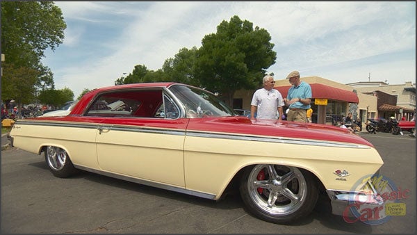
You should do red over cream
 Jake - Has Bad Luck So You Don't Have To
> Laurence
06/03/2016 at 11:15 |
|
Yup. Pretty much. Russians gonna russian.
 If only EssExTee could be so grossly incandescent
> Honeybunchesofgoats
06/03/2016 at 11:17 |
|
Feature-wise it replaces CS4, maybe. It’s long overdue for a major update.
 Jake - Has Bad Luck So You Don't Have To
> If only EssExTee could be so grossly incandescent
06/03/2016 at 11:20 |
|
That’s supposed to be more of an eggshell white/really light tan. But GIMP sucks and “gold” was the closest approximation I could get.
 If only EssExTee could be so grossly incandescent
> Jake - Has Bad Luck So You Don't Have To
06/03/2016 at 11:24 |
|
Were you using the HSV adjustment? Try the Colorize tool, or if you really know your color mixing you can use the Levels tool to adjust the RGB channels individually.
 Jake - Has Bad Luck So You Don't Have To
> If only EssExTee could be so grossly incandescent
06/03/2016 at 11:27 |
|
Yeah, I was using Colorize. It looked too “matte” so I set it to Overlay which works completely differently from “overlay” in Photoshop, so I tried “Hard Light” which just looked like ass, so I went back to Overlay and duplicated the layer a few times to get the effect right. In the process it totally ballsed up the quality. Meh.
 If only EssExTee could be so grossly incandescent
> Jake - Has Bad Luck So You Don't Have To
06/03/2016 at 11:38 |
|
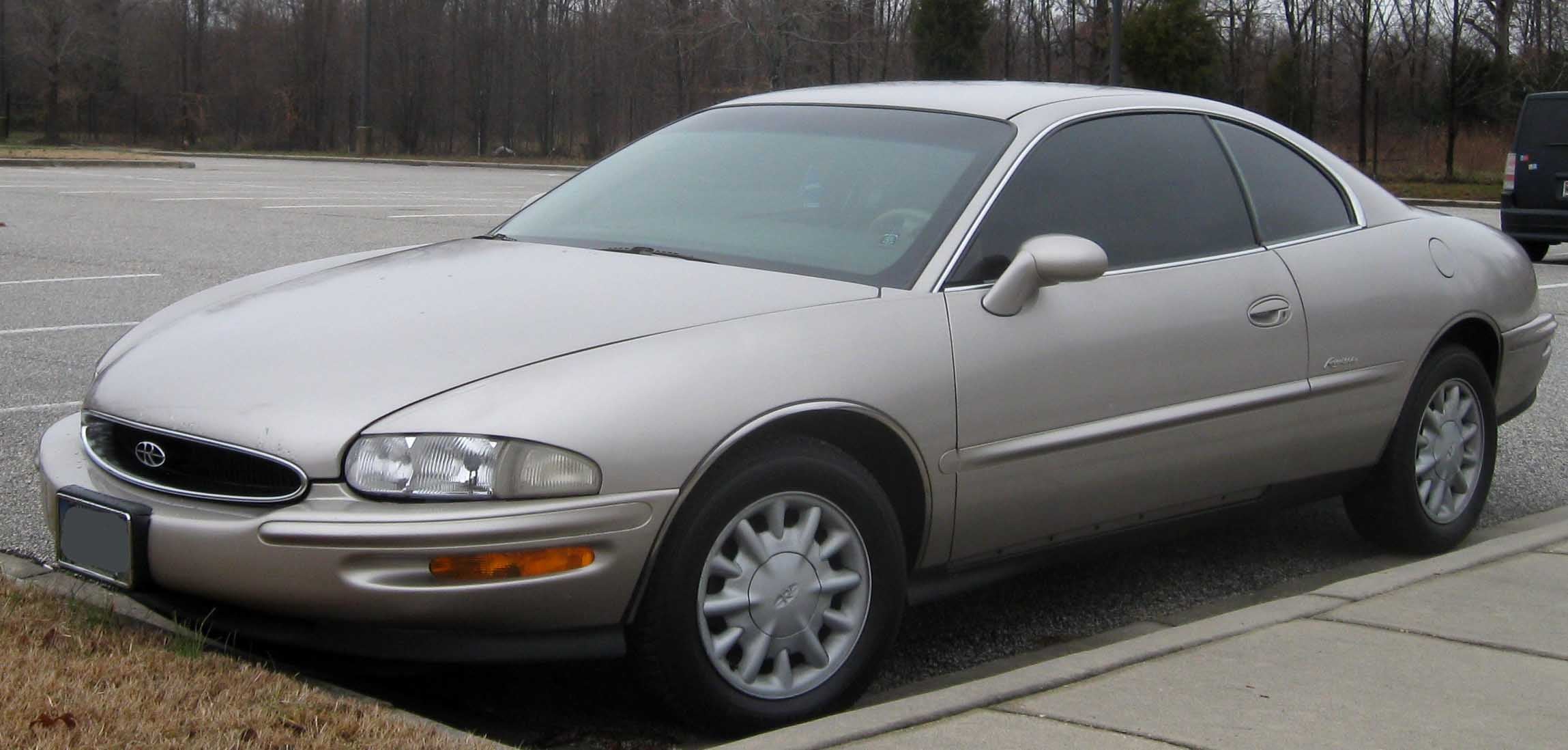
Well there’s your problem. The car in your source image was silver. The way the light plays out over the car is gonna make it look metallic no matter how you adjust the colors.
Duplicate your image as a new layer, then erase everything from it but the sheet metal. Desaturate, then invert colors. Make sure it’s on top of the original image and set it to Soft Light. I think in theory this should remove a lot of the “depth” that metallic paint gives. Might look terrible though, were I at my computer I’d test it before telling you to do it.
 E90M3
> Jake - Has Bad Luck So You Don't Have To
06/03/2016 at 11:43 |
|
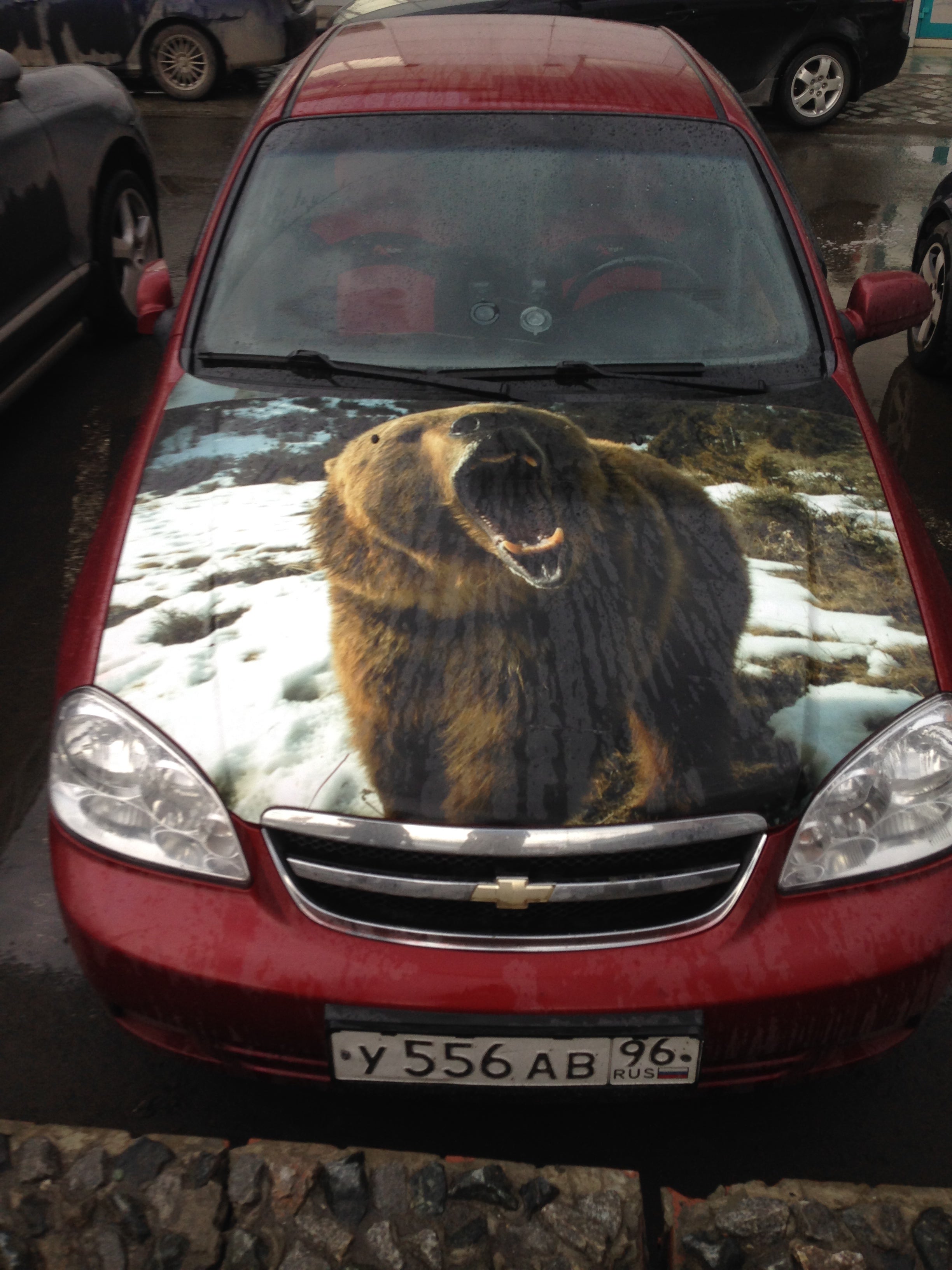
Russians gonna russian, yes they are.
 Invinciblejets
> Jake - Has Bad Luck So You Don't Have To
06/03/2016 at 12:03 |
|
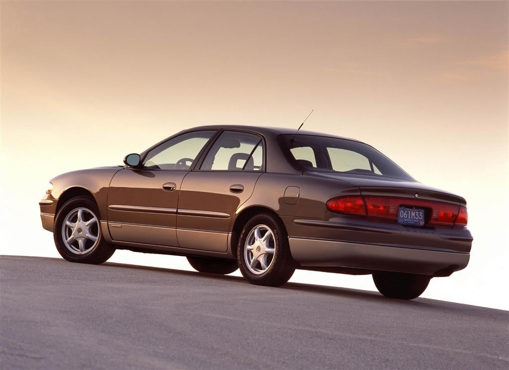
I like the idea of a two tone brown. Not sure of the version you gave tho..
I know it would be harder with rattle cans but I’d consider doing the two tone like this...
 punkgoose17
> Jake - Has Bad Luck So You Don't Have To
06/03/2016 at 12:06 |
|
Are you trying to emulate the Duesenberg Model J that is this first piture? I really like the brighter combinations like orange over cream. http://oppositelock.kinja.com/auburn-cord-du…
 Jake - Has Bad Luck So You Don't Have To
> punkgoose17
06/03/2016 at 12:20 |
|
Yeah, that first picture isn’t too far off, though the dark brown is going to be much darker.
 Die-Trying
> Jake - Has Bad Luck So You Don't Have To
06/03/2016 at 15:46 |
|
just make sure you use some high build primer, and block it out. that way you can get rid of all your surface texture, and imperfections. it should go a long ways toward getting the paint to come out decent,
 AMGtech - now with more recalls!
> Jake - Has Bad Luck So You Don't Have To
06/03/2016 at 15:46 |
|
http://alsacorp.com/killer-cans/
^ those^ are basically professional quality paints in a rattle can. They even spray an even fan pattern.
As for your two tone idea, try to carry it down to the dudes of the vehicle through the fenders, doors, and quarters. Two tones broken up by panel gaps just don’t look quite right.
 Jake - Has Bad Luck So You Don't Have To
> Die-Trying
06/03/2016 at 15:49 |
|
What does “block it out” refer to?
 Jake - Has Bad Luck So You Don't Have To
> AMGtech - now with more recalls!
06/03/2016 at 15:51 |
|
Dudes of the vehicle? You can’t see it in the photoshop, or even in the picture, but there’s a sharp crease that runs along the side of the car a half inch from the top, which is where it was going to be broken up at.
 AMGtech - now with more recalls!
> Jake - Has Bad Luck So You Don't Have To
06/03/2016 at 15:53 |
|
Sides. Damn Swype auto correct.
 Die-Trying
> Jake - Has Bad Luck So You Don't Have To
06/03/2016 at 16:01 |
|
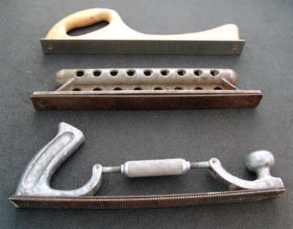
block sanding....... a good bit of it. lay down a FEW LAYERS of primer, and then a CONTRASTING color of primer as a guide coat. then you start flat sanding the panels...... depending on how many layers of primer you can get the panels pretty smooth. usually you end up with something that looks like a topographical map.
when you think you have it flat and smooth, you put ANOTHER layer of high build primer, and ANOTHER contrasting color of primer, and you SLOWLY sand through the contrasting guide coat to make sure there are no low or high spots. if you can manage that it should come out pretty smooth and flat.
you should be able to find something more in-depth on the old you-tube
 Jake - Has Bad Luck So You Don't Have To
> Die-Trying
06/03/2016 at 19:05 |
|
That sounds really excessive for a beat-to-shit dented Riviera that’s getting a rattlecan paint job, especially when high-build primer is $10 a can (!!!)
I’d rather just use some paint stripper and take that business back to bare metal.
 Die-Trying
> Jake - Has Bad Luck So You Don't Have To
06/03/2016 at 22:13 |
|
they also make air powered variants to make things go much quicker.